CORD SURFBOARDS

SHAPING SURFING SINCE ‘65

Cord Surfboards began on the Australian Sunshine Coast nearly sixty years ago. Founded by local hero David Lascelles, the company played a pivotal role in the explosion of 60s surf culture and was a mecca for the ‘Hot Generation’ of surfers of that era. Cord is steeped in surfing history and when David’s brother and surf legend ‘Chops’ Lascelles moved to Cornwall years later the family firm emigrated with him and a new era began. The company has now passed to his son Markie Lascelles and after nearly six decades shaping global surf culture the time had come to take the Cord Surfboards brand into the 21st century.

carruthers_tanner_cord_surfboards_2.jpg

OUR BRIEF

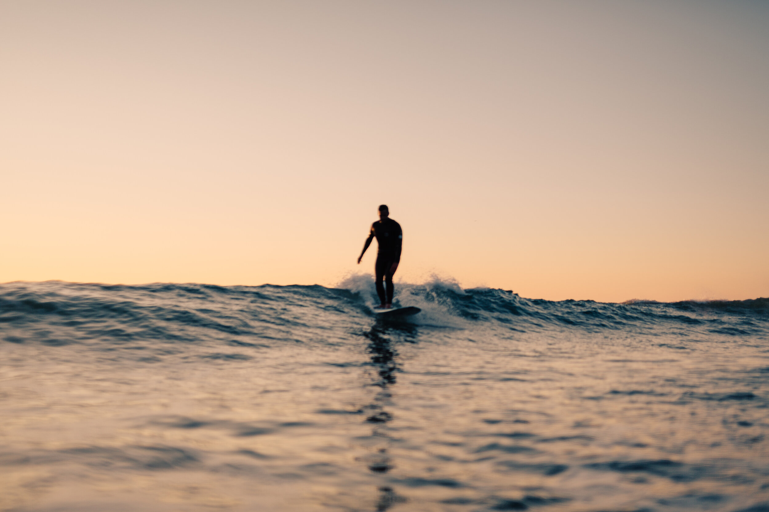
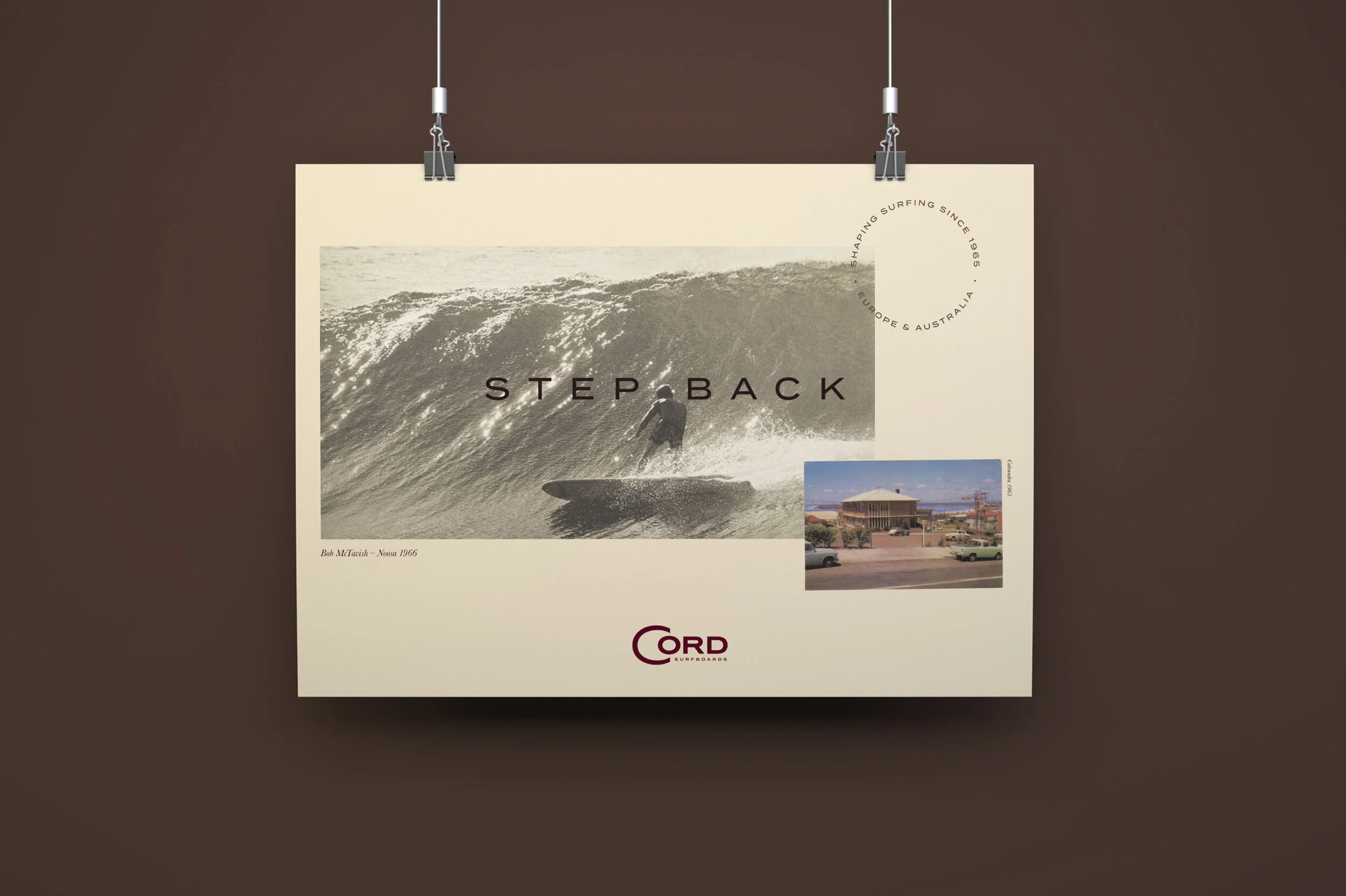
Our challenge was to turn a historic surfboard company into a brand that would not only appeal to its existing clientele of discerning surfers, but also a new high-end market of affluent buyers looking for custom surfboards from a company with genuine heritage and pedigree.

The new brand needed to be a celebration of classic board design combined with cutting-edge shaping technology and sustainable production materials that represent the next chapter in the companies incredible story.

carruthers_tanner_cord_surfboards_3.jpg
carruthers_tanner_cord_surfboards_4.jpg
carruthers_tanner_cord_surfboards_5.jpg
carruthers_tanner_cord_surfboards_6.jpg
carruthers_tanner_cord_surfboards_7.jpg

OUR ANSWER

First we looked at the Cord logo – a device that hadn’t changed in nearly sixty years. The handmade quality of the original typesetting and in particular the oversize ‘C’ had become an iconic symbol of the brands unique story but needed to be reinterpreted for a new audience. We redrew the logotype with with balanced proportions and a more sophisticated consideration for modern application whilst honouring the DNA of the original. Then we defined a specific palette of brand colours that would carry across the new limited edition range of surfboard models with vintage, sun bleached photography commissioned from Kirstin Prisk that could tie together the company’s illustrious history with it’s present day stories.

carruthers_tanner_cord_surfboards_8.jpg
carruthers_tanner_cord_surfboards_9.jpg
carruthers_tanner_cord_surfboards_10.jpg
carruthers_tanner_cord_surfboards_11.jpg
carruthers_tanner_cord_surfboards_13.jpg
carruthers_tanner_cord_surfboards_14.jpg

BESPOKE DETAILS

Arguably the most important incarnation of a surfboard company’s logo are the board decals. The orginal Cord device incorporated a space for the shaper’s signature so to underscore the bespoke nature of all Cord surfboards we pushed this idea further by creating an additional decal for the board underside that would carry the the shaper’s signature as well as the board dimensions and production number. Much like a Savile Row suit label.

carruthers_tanner_cord_surfboards_15.jpg
carruthers_tanner_cord_surfboards_16.jpg
carruthers_tanner_cord_surfboards_17.jpg
carruthers_tanner_cord_surfboards_18.jpg
carruthers_tanner_cord_surfboards_19.jpg

THE ‘BIG C’

One of the most distinctive elements of the Cord brand DNA is the horse-shoe like ‘Big C’ in the logo. We worked with one of our favourite illustrators and hand lettering specialists David Abbot and used this historic quirk as inspiration for a range of designs to be applied across Cord Surfboards apparel and merchandise.

carruthers_tanner_cord_surfboards_20.jpg
carruthers_tanner_cord_surfboards_21.jpg
carruthers_tanner_cord_surfboards_22.jpg

THE IMPACT

The new brand identity has had a rapt response from the surf community and new customers alike and has allowed the company to leverage the right pricing model for surfboards of their calibre. New doors have opened for co-branded promotional opportunites and they are attracting sensational team riders whose success and publicity they can now capitalize on.

Previous
Previous

Seagrown

Next
Next

Oceanium