


PRESTO MUSIC
WHERE LISTENING BEGINS
Presto Music is a specialist home for classical and jazz, trusted by serious listeners around the world. What began as a Leamington Spa sheet music shop in 1986 grew into one of the world’s most comprehensive online catalogues of recordings, scores and instruments – pioneering online classical retail in 2001 and now backed by in-house editors, writers and lifelong specialists. The business spans e-commerce, streaming and a physical shop, all under one identity.

OUR BRIEF
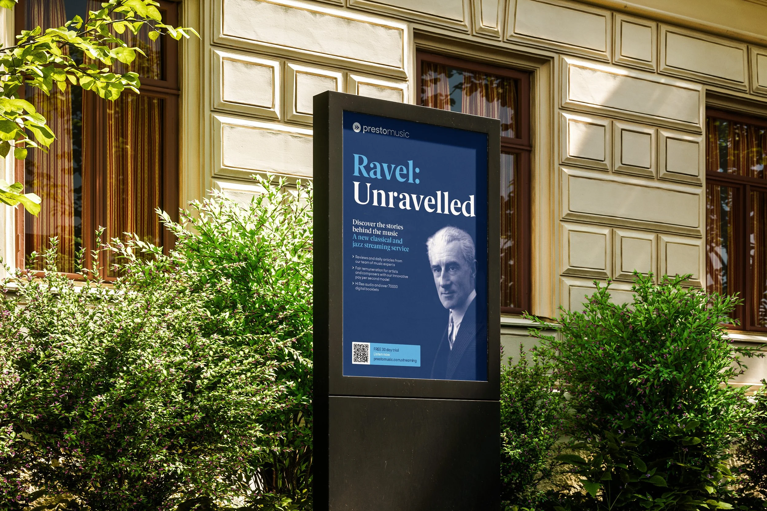
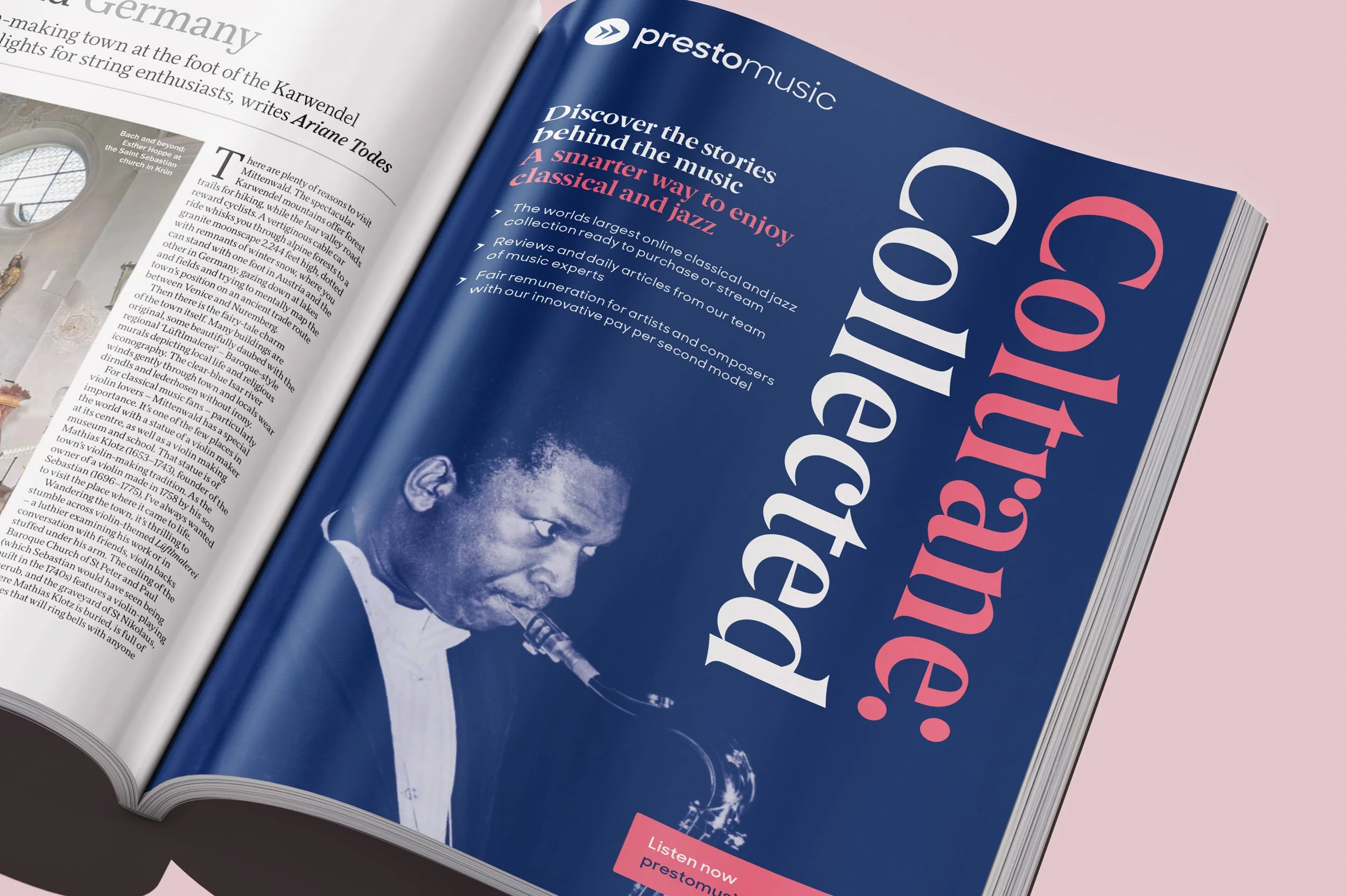
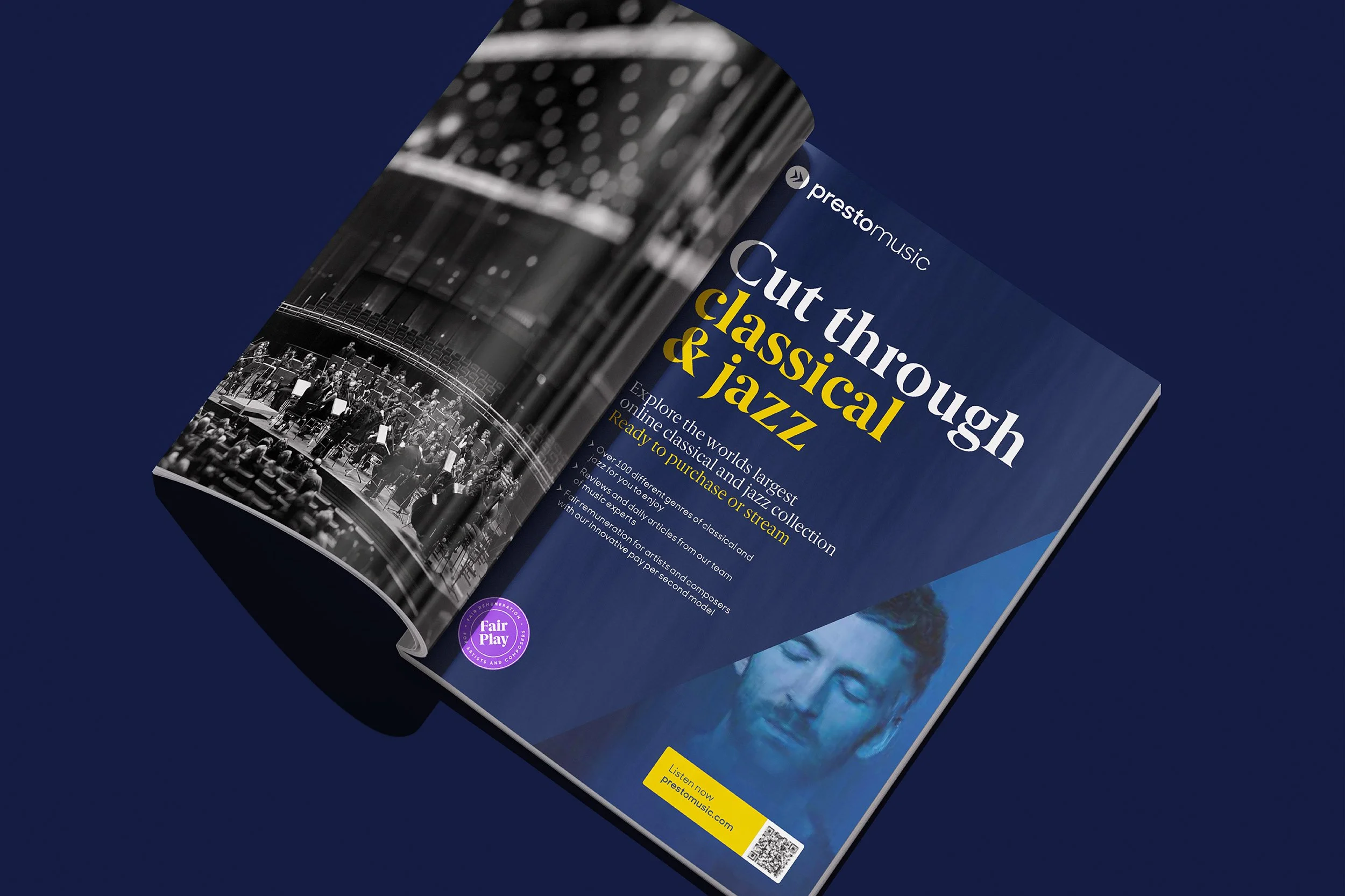
Our relationship with Presto began with an ad campaign for their new streaming service. The work we developed — a bolder editorial voice and richer colour palette — gave streaming a confidence and gravitas the wider brand hadn't yet reached for. In the months that followed, the gap was hard to miss. The new typography had crossed to the main website but little else had evolved, leaving the rest of the identity in a register that didn't quite match Presto's expert character — a mismatch Presto's discerning audience would have been the first to notice. Ahead of the 25th anniversary of online operations, we recommended a full visual identity audit. Its findings became the foundation for the core identity system that followed.

OUR ANSWER
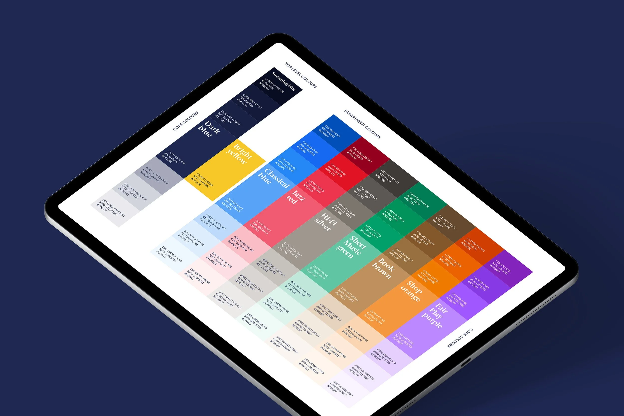
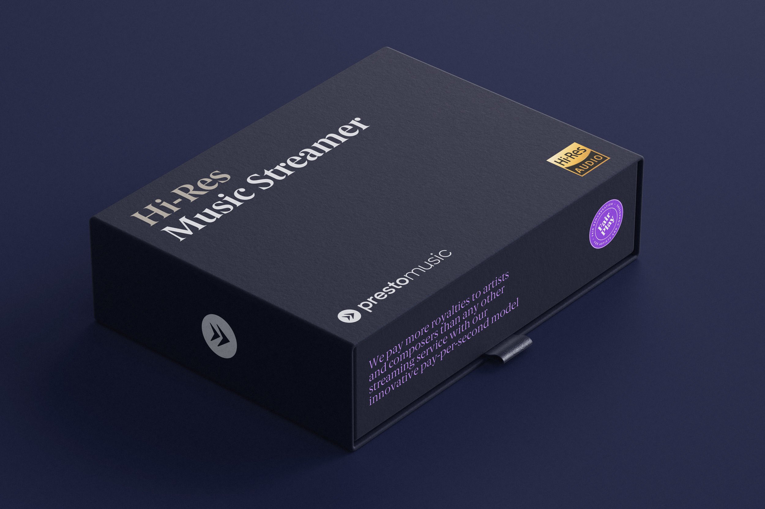
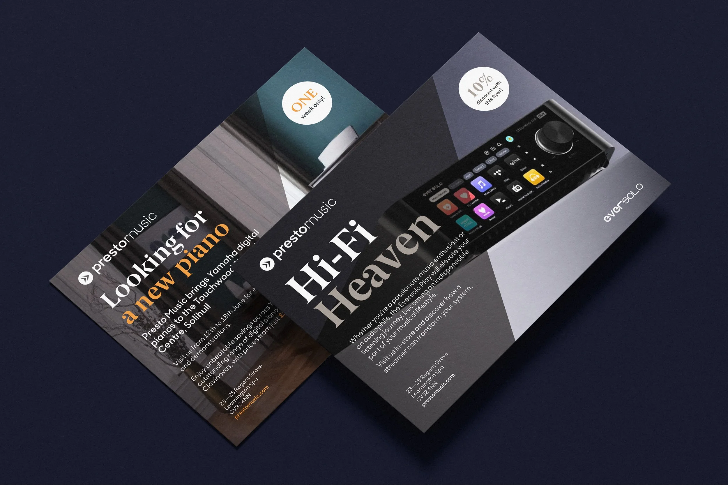
We began with a full audit of every visual touchpoint — logomark, fonts and colour through to the streaming app, email, social, retail, environment, events and awards — and built the core identity system the audit pointed to. A refined logomark pairs with a new wordmark, sharper and more confident together. A leaner two-font system — one editorial serif, one clean sans — replaces the previous three, balancing editorial weight with digital clarity. And a systematic colour palette anchors the brand on core hues while giving each of Presto's six departments — Classical, Jazz, Hi-Fi, Sheet Music, Books and Shop — its own signature within one recognisable whole.




WORKING IN CONCERT
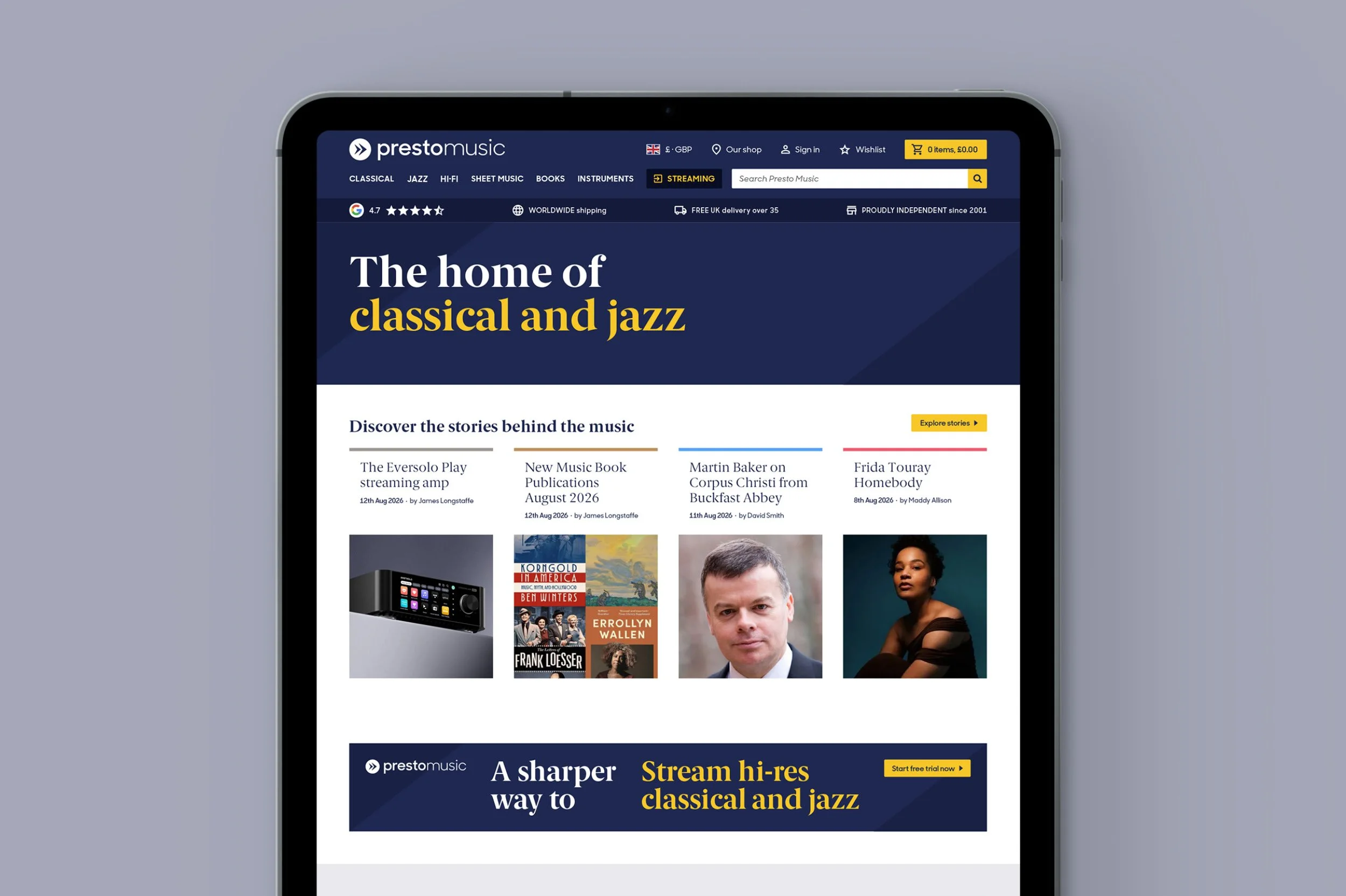
The brand system reaches across every part of Presto's offer — from the streaming campaign that began the conversation, to the refreshed website, a suite of print templates the in-house team can adapt for last-minute opportunities, and the brand guidelines that anchor everything. Built to be applied and extended, the system makes every touchpoint feel like the work of the same trusted specialists who chose what's in the catalogue.
PLAYING FAIR
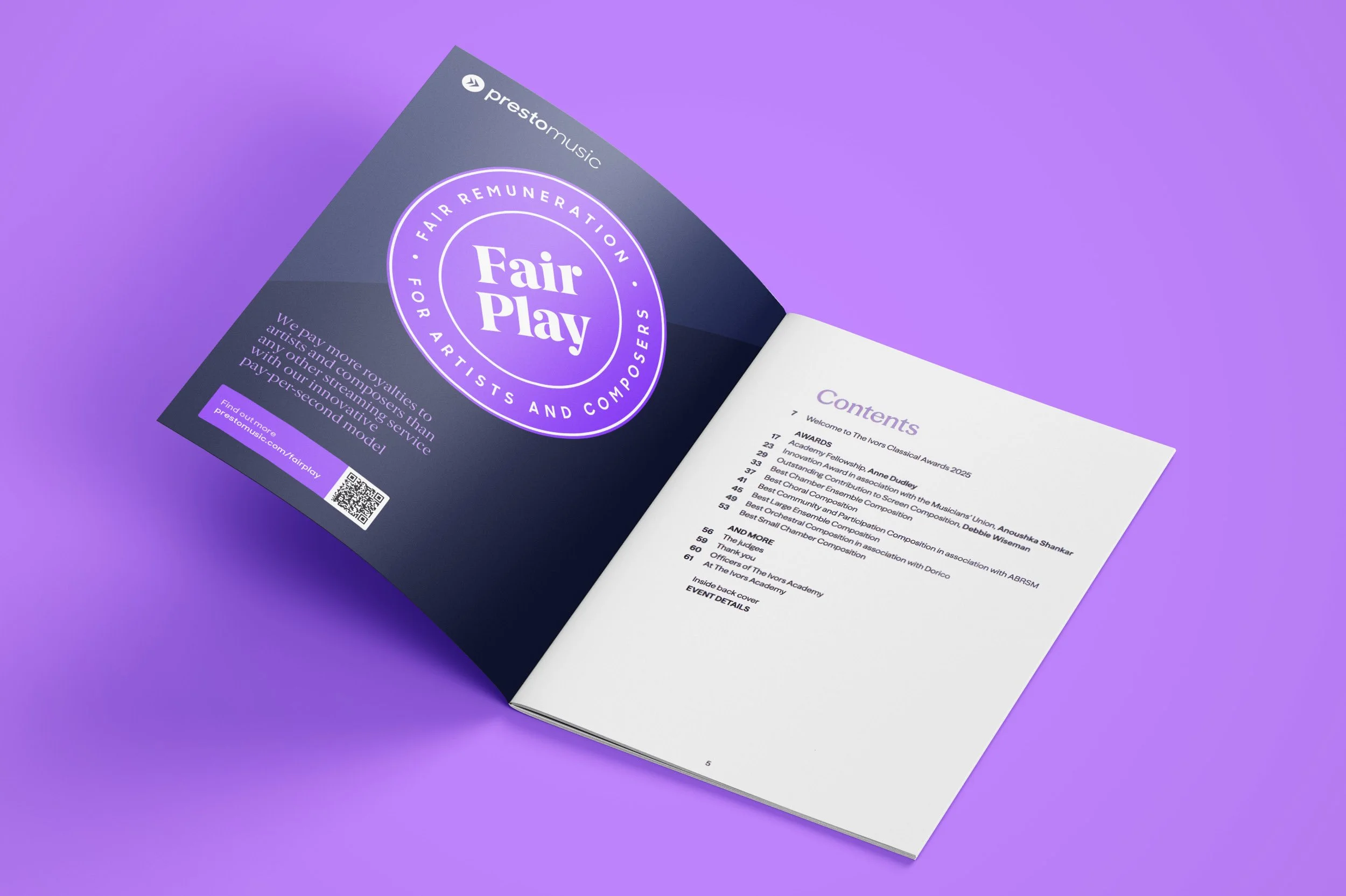
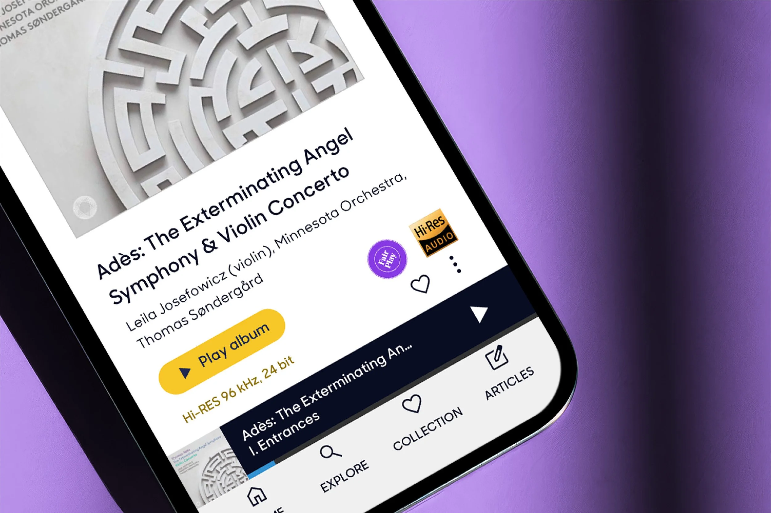
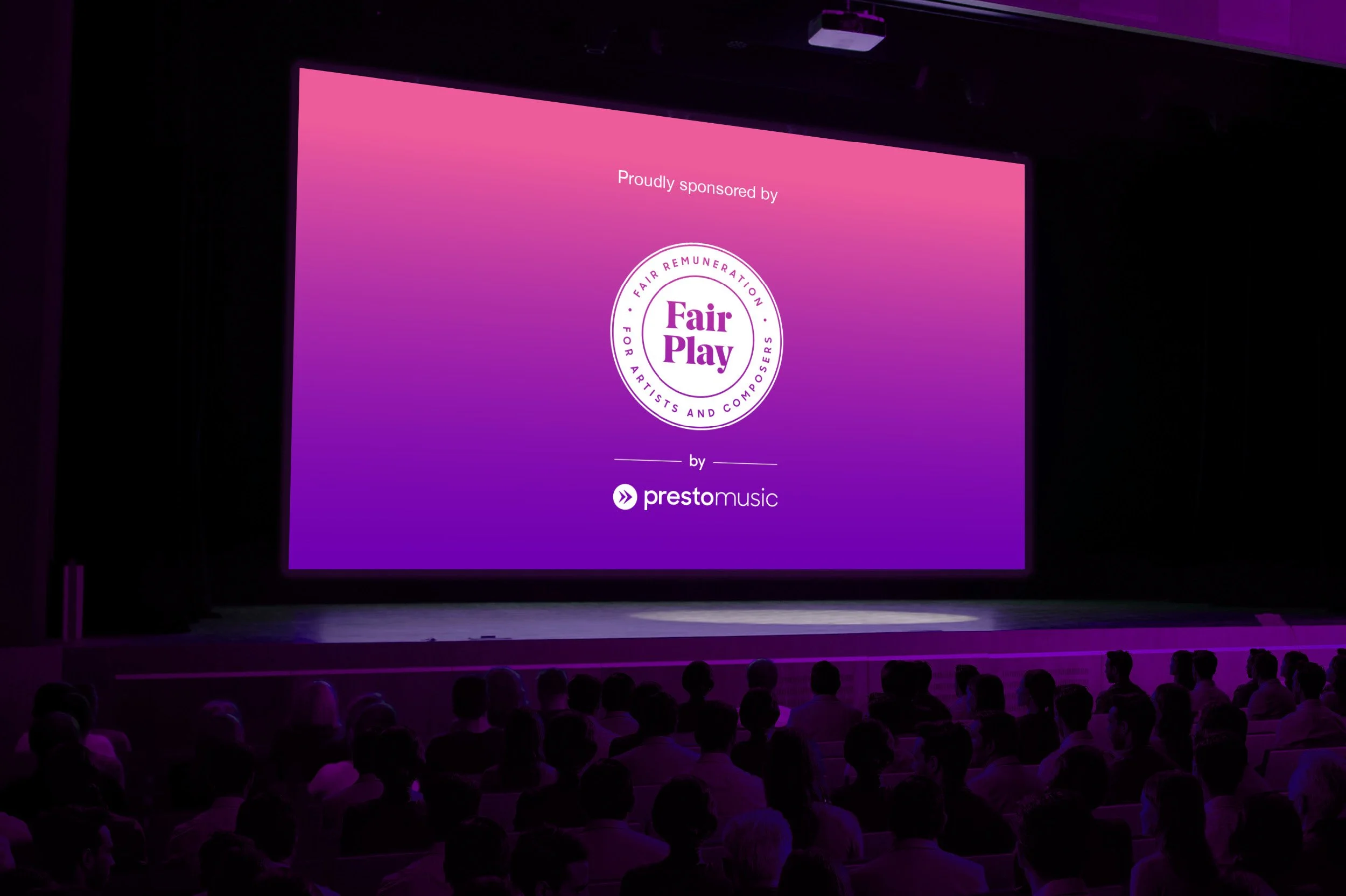
Presto's Fair Play policy pays classical and jazz artists and composers up to ten times more than the mainstream streaming platforms — a genuine ethical stance without its own face. We gave it one. An accreditation-style roundel in Presto's Fair Play purple, designed to travel wherever the offer is made — distinctly Fair Play, unmistakably Presto.
THE IMPACT
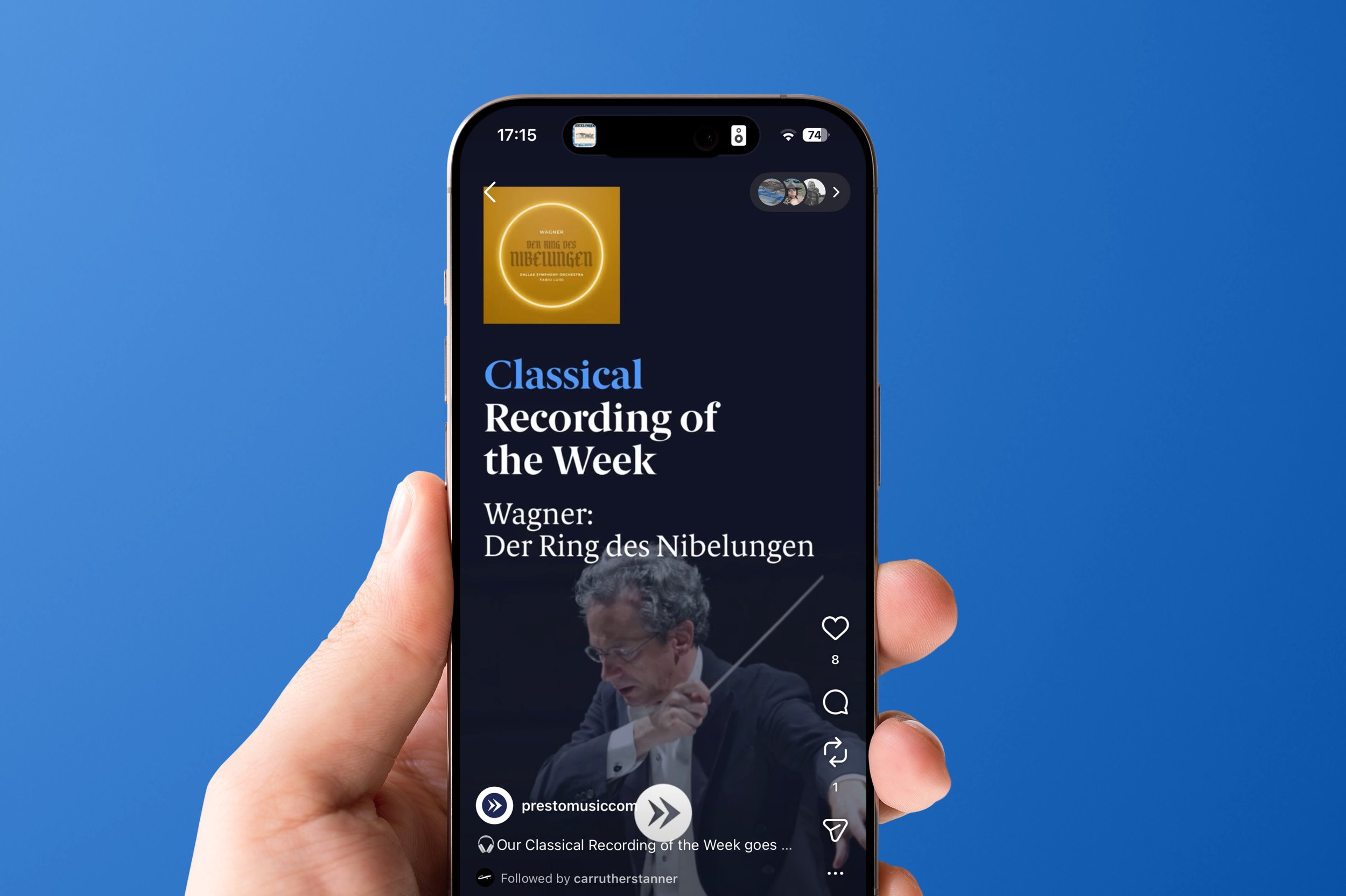
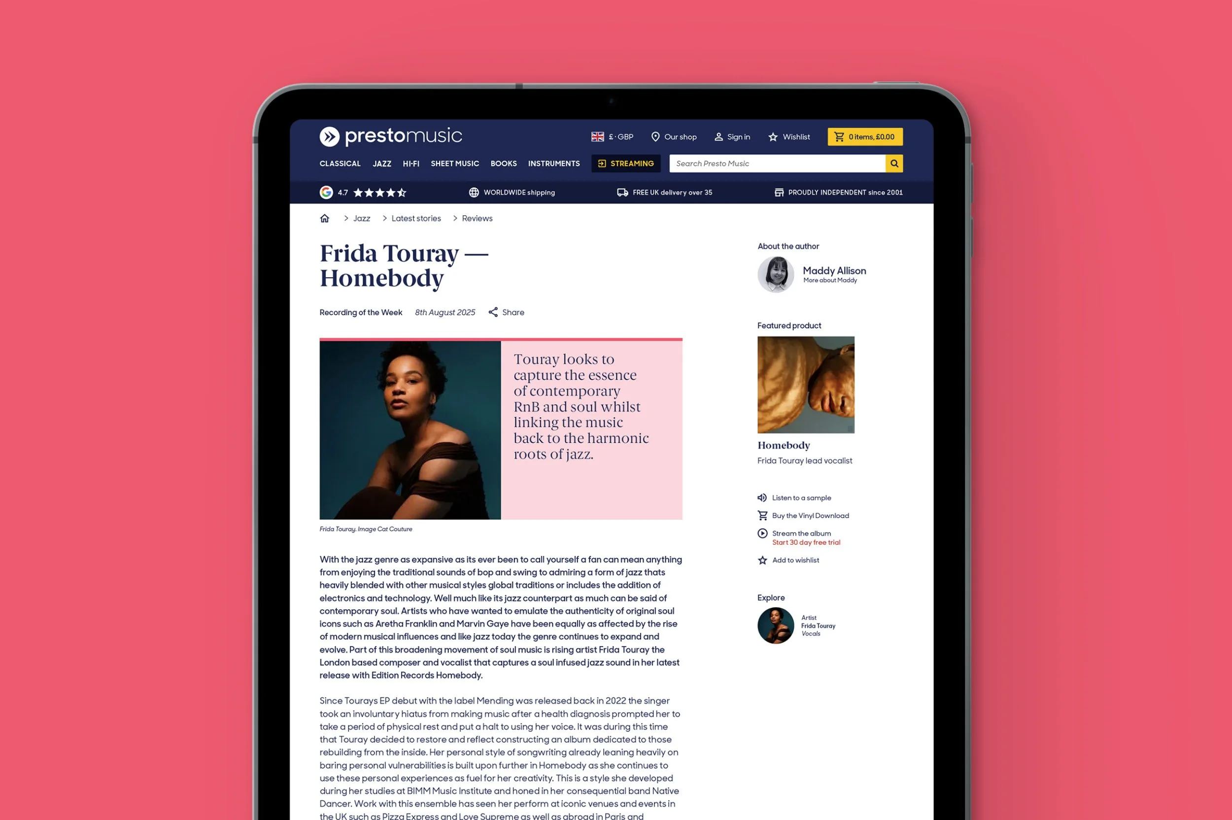
The refreshed brand went live on Presto's website, with the team applying it across social media and editorial content in the months since. The new identity gives Presto the visual presence of a true specialist — a system built to extend, with Fair Play the first of a growing family of sub-brand marks. Now in Presto's 25th anniversary year, the work continues.
WHAT THE CLIENT SAID
“What began as a brief for a streaming campaign grew into a complete rethink of how Presto Music looks and feels. Carruthers Tanner started with a thoughtful, rigorous audit of every part of our business, which revealed a bigger picture we hadn’t yet seen for ourselves. The brand identity we now have reflects the expertise behind everything we do, and we’ve trusted them with each new chapter since.”
CHRIS O'REILLY
CEO, PRESTO MUSIC